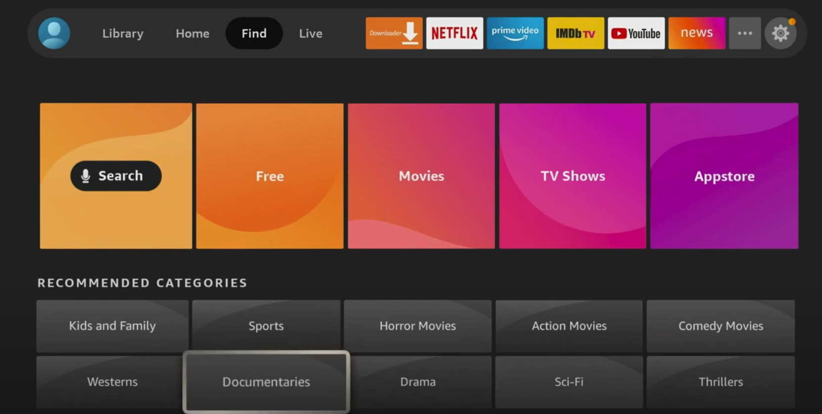
The new Fire TV interface has started making its way onto devices across the Amazon family of devices. The new-look is an almost total remake of the interface. Is there anything new? No not really. But the redone interface puts a lot of things in place that makes finding content much easier than before.
The new-look drops a number of tabs from the top of the page that had grown untenable as Fire TV added more and more capabilities since its last facelift. It’s most notable addition is the new “Find” section. The section includes Amazon’s search and a pathway to movies and TV shows as well as the Amazon App Store. A big improvement is the addition of the “Free To Me” tab in the TV and Movie section. This change, which has been recently introduced to the Prime Video app, allows users to find out what they can watch from Amazon Prime, IMDB TV, and any other service that they have subscribed to through Fire TV.
The new interface still holds on to the rows of content on the Fire TV home screen. A side by side comparison shows them to be identical to the rows found on the interface that most recently graced everybody’s screens.
A big addition to the system is that the new setup provides easier access Fire TV’s new user profiles which allow users to customize their experiences, watchlist, and apps. The system also holds on to the live section which integrates multiple live streams of content into one grid allowing users to access live streams from Pluto TV, antenna-based signals from Fire TV OS powered devices as well as for users with a Fire TV Recast DVR. Users can even integrate a number of cable replacement streaming services as well as any live feeds available via Amazon Channels based subscriptions.
Overall the new look is a more accesable version of an already popular system.
If you haven’t seen the look for yourself take a look at our comparison below.


Until it gives an apps only option (like Roku), I won’t use a Fire TV device nor recommend them.