Roku is already the most popular streaming platform in the US. Part of that is because it defined the idea of set-top streaming. Part of it is that they are easy to use. But we have been thinking of ideas that could make the Roku more fun to use and a more valuable partner to multiple industries. Take a look at some of the idea we have been thinking up.
Audio Player Skins
Roku has a ton of great music and podcast player options. All of the big musical services are available on Roku aside from iTunes. But
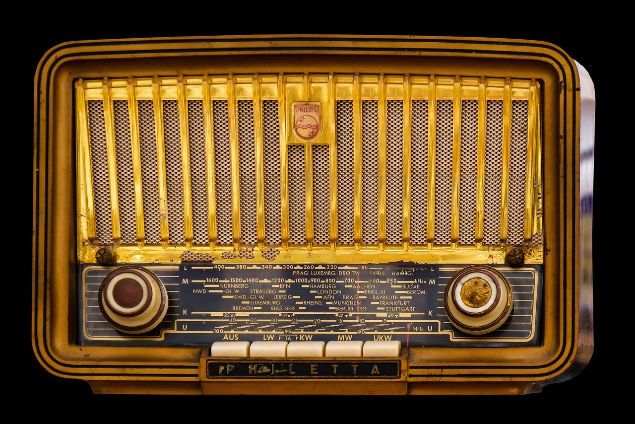
they all have one drawback. If a user is listening to audio content they must look at either some kind of album artwork in the case of something like Amazon Music or Pandora or in the case of I Heart Radio a listing of a radio station they are listening to. Wouldn’t it be nice if Roku had a couple of default skins or screen savers that allowed users to enhance or even dial back their screens when accessing content that did not require a visual. A search for black screen relaxation videos on YouTube will show the need for things like this. Roku could get very creative though. It could for instance have interactive screen savers that looked like radios on the TV screen. Imagine listening to a talk show and seeing a screen that looked like a big RCA radio, with the little lit up dial in the middle. Or if your screen could look like a boom box or a shinny 1950s juke box. Even a black screen for listening to music while you fall asleep. Or a full screen lava lamp?
Building a cross platform watch list
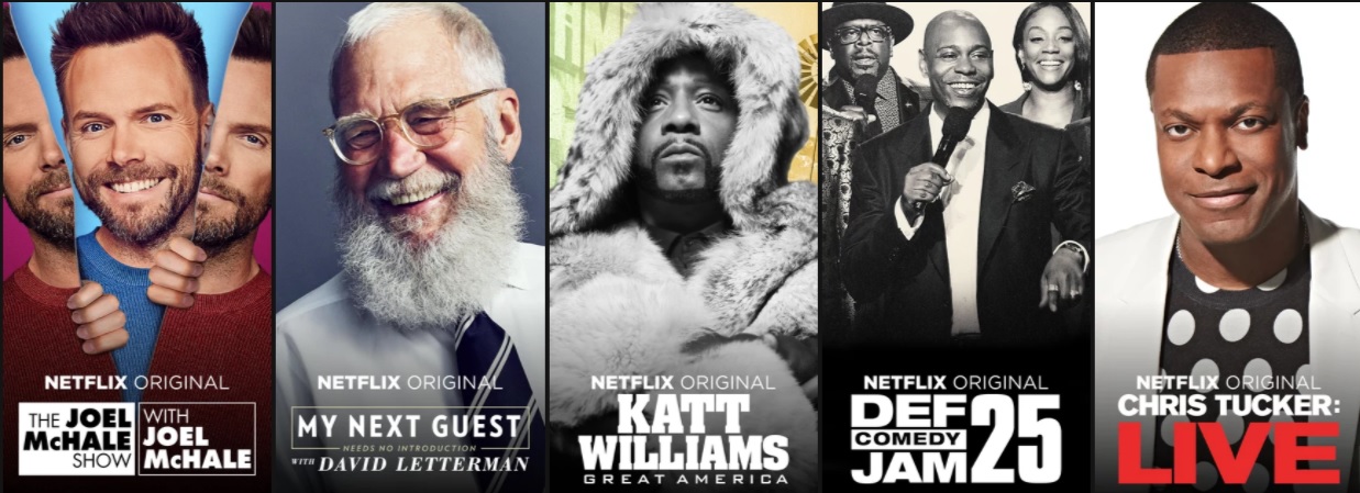
Roku almost has a perfect feature. It’s called my feed. It allows users to select a movie or TV show to follow and check in on in order to see if it is available on any Roku channels. This is very helpful and can save time finding things because you don’t have to keep looking to see where you can watch it month in and month out. But what if it did more. Imagine if while you were bouncing around your apps that instead of saving something on a list for Hulu or Netflix or Tubi TV you could save it to a watch list where everything you liked to watch from every service you subscribe to or follow for free was. After chasing a selection the app could jump into action like the featured free option. There is so much to see on these streaming platforms and things like the Roku channel are helpful. But personal streaming playlists would be awesome.
Local channels or cable channels in Roku Channel Live TV Grid
Not everyone has the live TV grid on Roku yet. But eventually most Roku users will. And for all of the many channels listed in the grid it would be more of a can’t miss place to jump if it integrated local TV channels. At the moment Roku players do not have a spot to put an antenna but there are a number of tuners on the market that are supported on Roku channels, Air TV, Tablo, HD Home Run among a few of them.
Ability to sign up for apps with one click
Setting up most channels on Roku has always required too many steps. Add an app, launch it, read the message and go to a website, type in a code, sign in on mobile or laptop, wait for screen to change etc. The Roku is already connected to the Internet. Roku also has credit card info and a relationship with the service behind the app. Isn’t there a way to make this more seamless. It would be great to see Roku work more like Apple on this front. If you are signed in with a provider like a cable company or even say Philo Roku could acknowledge that and ask you authenticate a TV everywhere channel based on the sign in and password. If you want to sign up for a Crackle Plus Account why not just click sign in and let it be done? It would help out so many people who want to get to the action on the big screen instead of fumbling around on a phone or walking to a computer. And its partners would probably get a lot more activated accounts as well.
More customizing Changing background colors, changing colors for menu selections changing size/Font of menu selections
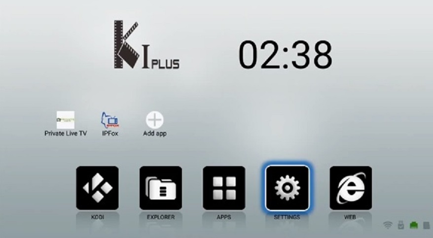
Love it or hate it Kodi has one thing all over the rest of the industry when it comes to interfaces. It is very customizable. And while Roku and all other products have a reason to look a certain way as far as ads and other issues Roku does already offer skins. And the skins are fun for those who like to personalize. But there is a lot more that could be done. It would be great if you could edit the background colors. While Roku has a number of pre fab skins and themes, the ability to choose a background with a color wheel would be a great touch. How about an option for changing the fonts and colors of the menu items. I’d love to have a Roku with a deep Burgundy screen, and large Bold face cursive silver lettering. Roku could hold contests to submit your skins like Nintendo does with Mii creations.
Folders building on zones Maybe integrate zones as channel blocks
Roku zones are a cool and rather underreported feature. If you are unfamiliar they work like this. You are searching for let’s say Jurassic park. You may find a Jurassic park zone in the returns. The zone would then be populated with rows of relatedJurassic content such as all of the Jurassic park movies found on Roku and where to get them whether for free or rent. It may suggest Movies staring others from the series like Samuel L. Jackson or Chris Pratt or even Newman! Roku should add a way to make these into channels that appear on the grid for future reference. This way you could find all the Die Hard movies in one place then bounce around and see other movies staring Bruce Willis and maybe even find other zones for Action movies or buddy cops , etc. I think it would be very engaging.
Bring Back the New Category in the Channel Store
What’s new and exciting? Isn’t that what we always want to know? That includes on a Roku. This is a category Roku has had in the past but removed it a few updates back. This missing feature makes it so much harder for new services to get in front of an audience. People love seeing what’s new. It builds excitement. Come on Roku flip the switch.
Ad Live TV To the home page
Roku probably has its reasons to have their new Live TV guide in The Roku Channel, but it sort of gets lost there. It is already set up for so many other things. But if it were a home menu option it would be more of a starting point for people. And if user could even find their live local channels in that spot as per an easier suggestion that would be all the better.
Revamp The Roku Channel
Roku could give the channel with its name in it a more like a modern feel. When Roku came out all of its channels were either long content rows or simple grids. When Roku laid out its all new signature channel it kind of went retro. The Roku Channel looks a lot like a Roku channel from 10 years ago vs the slick apps for Plex, Hulu or Netflix.
Add a Coax port to the Roku Ultra in order to add antennas
Roku TV’s have a spot in the channel grid for antennas. This is where users who have antennas hooked to their TV can interact with the local channels they receive over the air. Roku player in the US do not even though models made for European markets do. Maybe the ability to use an antenna with a Roku is something they have an agreement with their TV partners to limit to them. But if there is not a contractual reason to do so, it would be of great help to at least half of its user base, which are cord cutters, to offer that option. Reserving such a perk for Roku Ultra would increase its appeal.
Add an HDMI in to the Roku Ultra
Also on the Roku Ultra front why not an HDMI In port. I know that it would lead some people to plug the HDMI In port to the TV and wonder why it was not working. But if there were a namable HDMI in port it would let users plug in video game consoles, or even their digital cable box. One of Roku’s most popular offerings is the Spectrum TV app. So people with cable ovviously use Roku for this purpose. It would be fantastic if any cable user could access their cable channels through a Roku so that they could have all of their entertainment in one place. I would probably even hook up a splitter. And though they may not want people to have devices from other companies emagine how nice it would be for customers to be able to hook a chrome cast, Fire TV or even a fire TV stick into their box and have all of their streaming needs at their fingertips.
Alternate colors
These days most Roku’s are either little black boxes or little black rectangles. Of course there are also the little black sticks. Remember when Roku’s could be red and purple? Roku had an Angry Birds branded box that was a bold red. It was no different from any other Roku aside from that. Roku and most companies probably go with black because it fits in with all of the black TVs, speakers and receivers. But there could be a lot of people who would enjoy something with a little more pop. Apple does this with their phones.



Ok