What is the New Google Chromecast
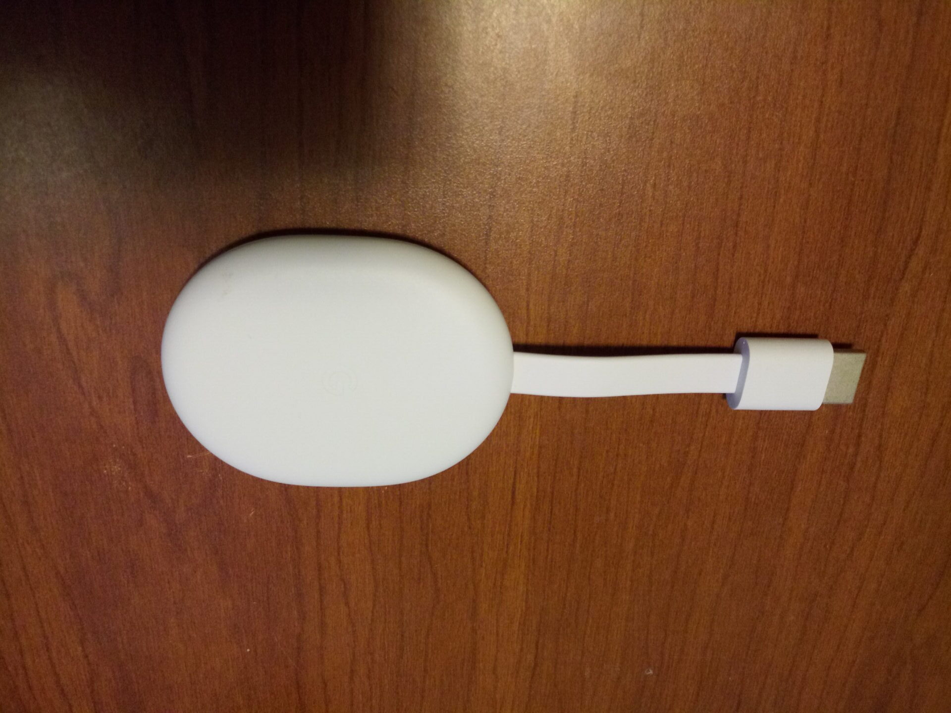
The Google Chromecast “With Android TV” as it is being marketed is a next generation product from Google who has finally taken a leading role in designing a streaming device and interface after years of leaving it up to partners. The device ships with a palm sized dongle a remote, a USB C still power cord and an adapter.
Saying Chromecast and controller in the same sentence seems odd. But it is a welcome improvement. The new device though really is not what anyone
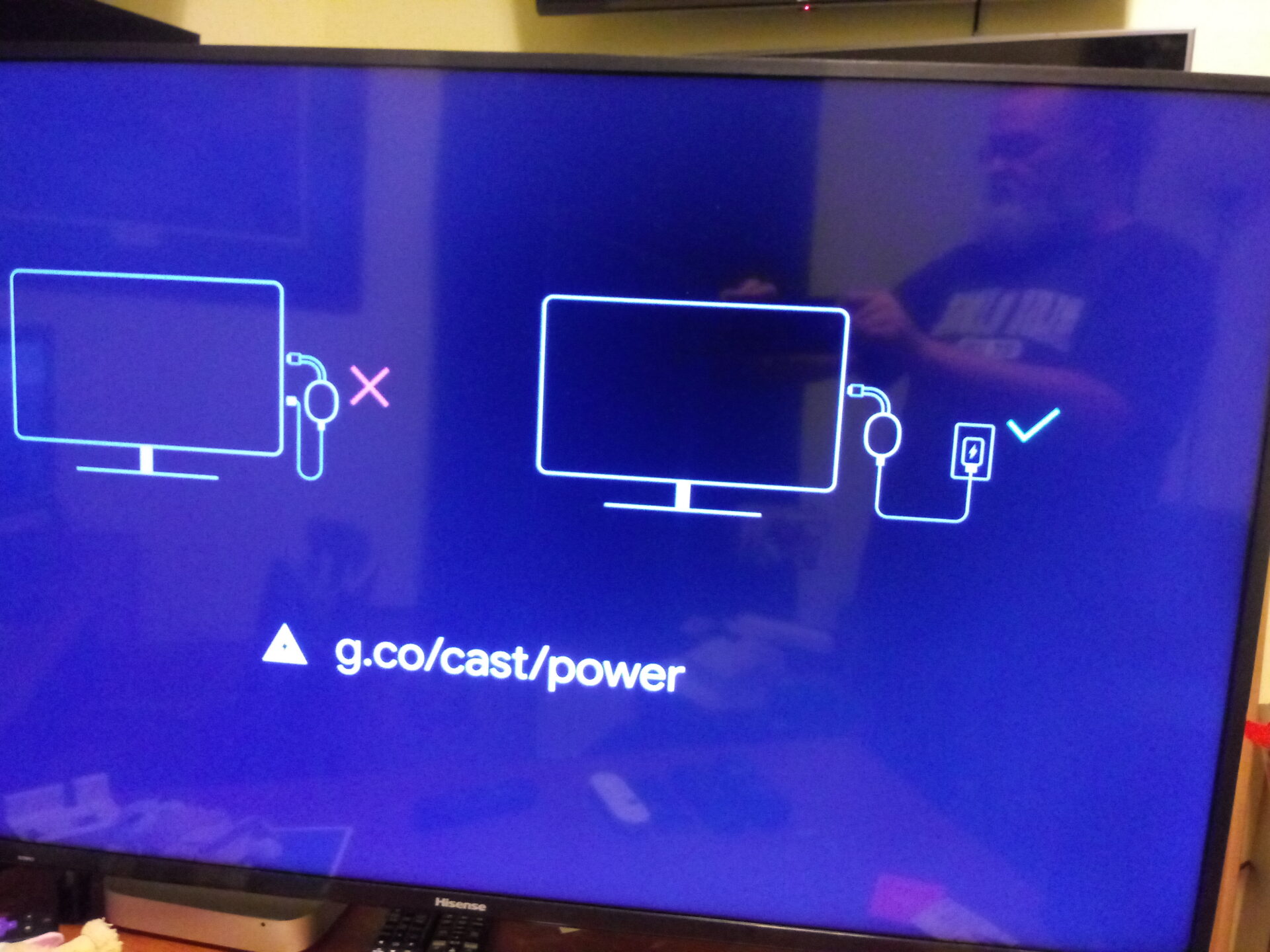
would call a chromecast. The original chrome casts ran on Google Chrome and had no actual interface. They do not have remote controls because all of the apps and content are delivered via a phone, tablet or computer. This item is a full streaming interface, with an App Store and all the bells and whistles. With those bells and whistles, which includes Google Assistant built in, comes the need for more power. This means that users will have to
First the most basic information.
Price
It costs $49.99. This puts it right in the sweet spot with the Roku Streaming Stick+ and The Fire Stick TV 4k.
Resolution
Up to 4K HDR, 60 FPS
Supports resolutions up to 4K and high dynamic range (HDR)
Video Formats
Dolby Vision, HDR10, HDR10+for stunning picture quality.1
Ports
HDMI to plug directly into the TV
USB Type-C power
Connectivity
Wi-Fi 802.11ac (2.4 GHz / 5 GHz)
Bluetooth®
Operating System
Android TV OS
Setting up
This is the hardest device set up and use I have run across in years. There were multiple issues getting signed in to my Google account. There were multiple issues signing into my home WiFi account. I have probably set up 100 streaming products since The Streaming Advisor launched in 2012 and have never had to spend so much time working out issues as I did with this product.
Set up for the Chromecast with Google TV or Android TV is a surprisingly difficult process, at least it is if you are not signing in directly with a phone. I don’t usually set up devices using a phone because I want to see how the process works for people like my mother, my aunts and others in this world who do not have smart phones. In fact when given the choice to set up by signing in with your phone is presented one would get the impression that choosing not to would then avoid the need to use one at all. This is not the case. Once you are prompted to sign in to your Google Account with your password Google will then try to send you a notification to your phone. In our case the notification came through with a simple yes and no question and answer. I verified that I had in fact signed in. But the process did not move forward. So I asked it to resend. Again I was sent a message to verify my self and it did not work again.
In the end I tried multiple other options before finally getting one to work. One unsuccessful attempt asked me to go into the settings for the phone and find a 10 digit security code that also did not move the process forward. Going back and forth in phone settings and choices and re-entering my email password took over 20-15 minutes. It was just one glitch after another to deal with. And for a person who does this as much as I do that should not have been such a problem.
Once we finally told the Chromecast Yes for the 6th time using another option it moved on to a screen that asked me to choose apps I had. I did so but then had to wait 10minutes or more for the apps to install and we were only installing 7.
Getting on WiFi
Another issue we had was setting up our home WiFi network. Our device recognized our two networks but would only connect to one of them. Now to be fair the Chromecast was not right next to the router but it appeared that the WiFi Antenna on the device was not strong enough to access both networks. Even once we selected our 2G network we had to re-select our WiFi network once the device was turned off and back on. This is not typically a problem on the other streaming devices we work with including Roku powered TV’s from TCL and Hisense, The Latest Roku Ultra, The 4k Apple TV, multiple iterations of the Fire TV Stick, an iMac, Windows computer and so on.
App selection
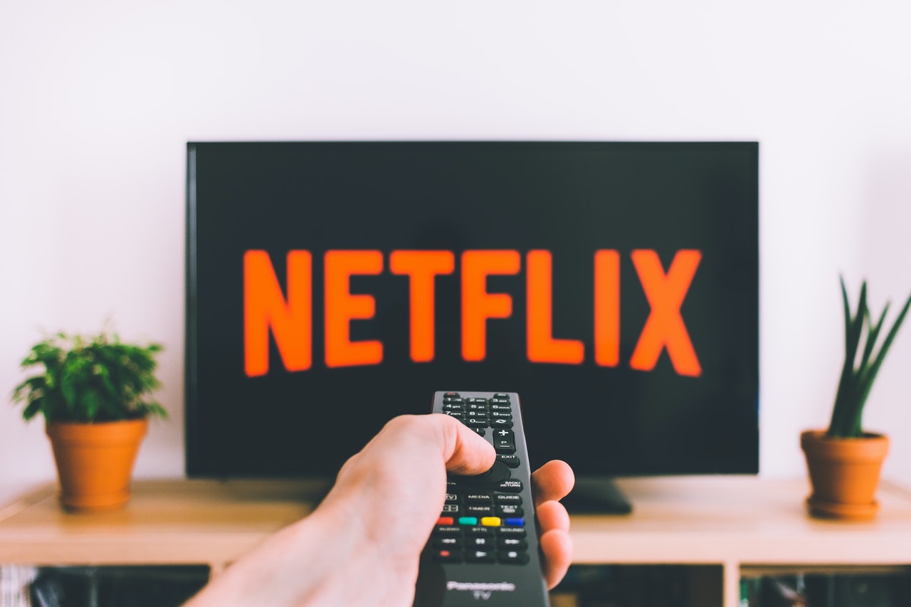 Finding apps on the device is a little different than with most streaming systems. The App Store is built into the overall interface and can be found in the tab called apps. This means users will not launch apps by clicking on say a Google Play Store app like they would on a phone or Android TV devices. The Google Play store has lots of apps but it is set up in a way so that you do not get overwhelmed when you first jump in. There are categories based on topics like Stay informed/News, Catch Live Sports or Listen to music. The system places the most well known apps at the front of the line. For instance the Sports row will feature ESPN, The NFL App and so on. Asking Google assistant to show you sports apps will pull up a list of 20. Is that all of the sports apps on the device? No. But if you want to add something that is not initially shown via the top 10 sports apps displayed you will have to search for it individually. We took at look at it side by side with an Nvidia Shield, which is powered by Android TV. The App Store has an almost identical layout and the same categories. The difference though is that if you search for “sports apps” on the Chromecast you will still only be presented with as few as 20 apps on the other hand the Google Play Store on the Shield presents far more choices. Users can find more apps listed via a categories row. But what the app store does not do is break things up into categories based on how users interact with them. For instance Apps that require Cable or TV Everywhere apps like (NBC, Animal Planet Go, Fox Sports), Premium service apps (like Netflix or EPICS or Disney+) There is no choice to scroll through all of them. I am not a fan of app stores that limit you to what you can think of off the top of your head because its unfair to the developers as well as a burdensome task for the consumer. It is much more helpful to let people know from the start what to expect. Otherwise it creates confusion. On a positive note it does include the Amazon Prime Video app which used to be a big issue for Android TV devices.
Where are the settings?
Once you get to the end of the setup process the dongle will launch the new Google TV screen. Immediately you will notice the movie and tv choices and rows of content but you might notice something missing in the horizontal menu. Settings. There is not a spot for settings on the home page at all. Other streaming devices place setting in an easy to find place. For instance, Googles “Android TV” OS as found on devices like the Nvidia Shield console has a setting button in the upper right hand corner. Fire TV has a setting tab at the end of its main horizontal menu, Roku puts settings on the home page at the bottom of its menu. Google TV has no settings displayed on the home page at all. How do you get to the settings for the device? You have to hold down the Home button on the remote until the option pops up or ask Google assistant to launch Settings. I only found the option to use the home button by accident trying to fix something else. Once in the settings menu it is complicated but not so much more complicated than it is on other devices. Jumping into setting is getting into the weeds.
Interface
When one presses the home button on the remote they will be brought to a tab called for you. We can only assume that it will grow with you based on what you watch. Like the Android TV interface it is based on the Google TV interface features a home screen with a series of rows starting with installed apps. The system will display 12 installed apps and afterwards create a box called See All in order to access the rest. The apps can be moved around on the row in order to place your favorites at the front of the list. The new system differs from its predecessor though in a number of ways. For instance the rows on Google TV are broken up into genres and populated with content from across your installed apps. Therefor you will have rows like Adventure Movies, Futuristic Movies, Romantic comedies etc. The choices in each category can be from one of many apps. You will see a selection from Netflix next to a selection from Tubi TV. There are also selection from Google video rental services rolled in as well. This is not optimal. Amazon has a similar approach on the Fire TV. The approach is the latest to put meta browsing in place and could be very helpful. Users can jump into their apps if they prefer to see what is in a given package, but the name of the game is becoming content discovery. One great aspect of this approach is that shows and movies available via TV providers like Sling TV are included in the choices. It combs through the choices across the individual channels in order to populate the list.
Overall the interface sort of feels like each screen is the same thing or that the entire interface is an app. Hulu has a section for TV shows, and movies broken down into genres, now Google TV does this too. It is a very different approach to a streaming or smart TV interface. Time will tell whether this
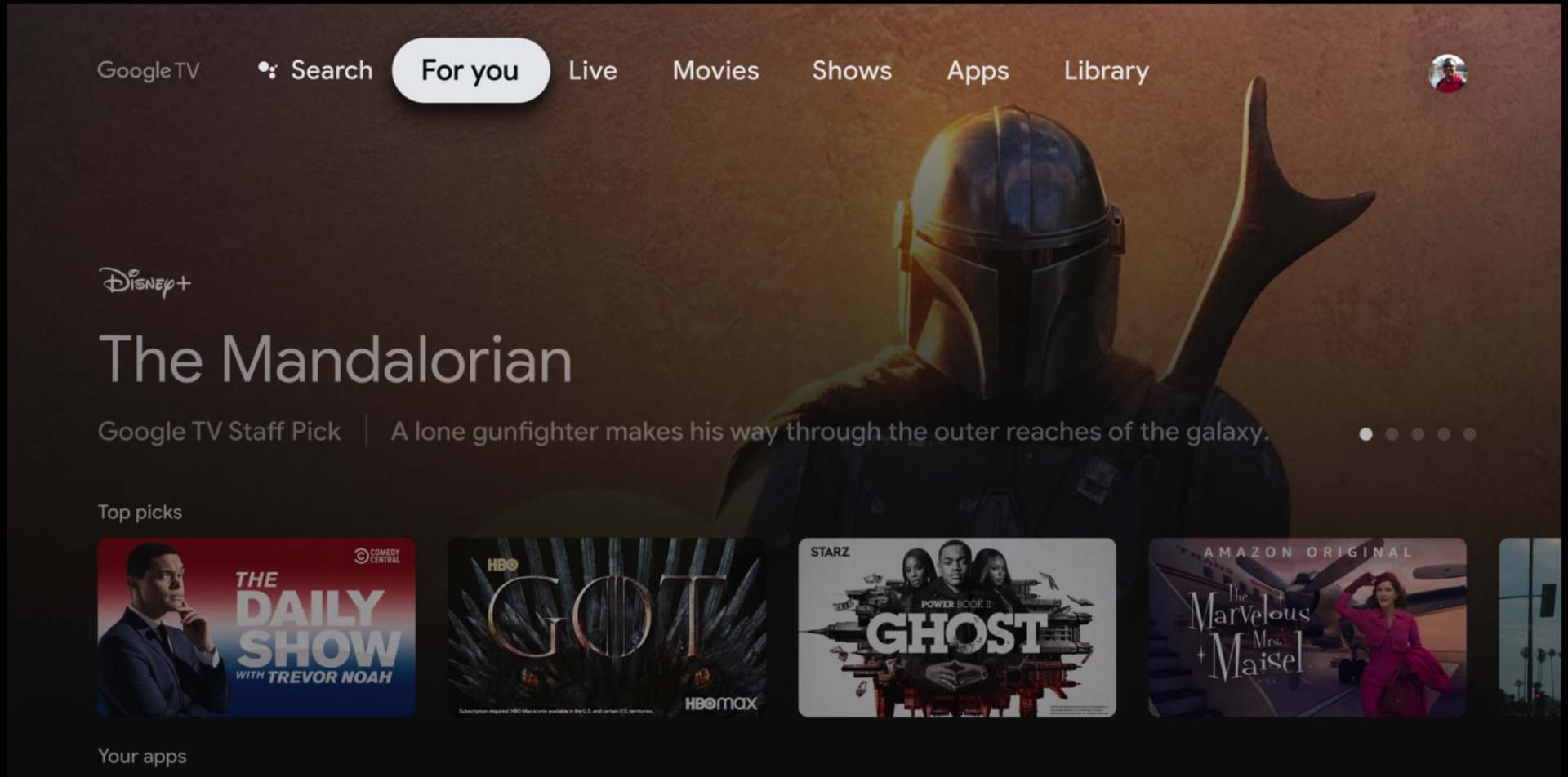
approach is easier and more fun to use or if it is more confusing.
Side loading
This problem may be less frustrating to some folks. But Android devices have always been popular because they support apps from outside the official App Store. In order to allow apps from outside the App Store one typically will launch the settings of their device, find the app permissions and allow apps from outside sources. The new chrome cast does not make that option autamaitally available. In order to allow your device to download apps from outside the App Store you have to make yourself a developer. To do this you must launch the settings by holding down the home button and selecting settings, Toggle To System, Toggle to About, and toggle down to the Android TV OS build. Once you have selected Android TV OR build tap the remote button 7 times. Once you are a developer you can get back to side loading and add other app stores, browsers etc.
Controller
The controller is one of the smaller ones I have used on a mainstream device. Like most others it is minimalist in its approach. There is a directional button with a main selection button in the middle, there is a back button to back out of apps, a button for Google Assistant, a home button, a mute button a quick launch button for YouTube and Netflix as well as a power button and input button. We could not get the input button to switch to anything else on our Roku Powered TV though. The remote can be programmed to control the volume and power of your TV. Think of a remote for a second, any TV remote. Where do you find the power button? If you said at the top of the remote and usually on the left corner you would be describing every remote I have ever owned. But this remote places the power button at the bottom of the device. You can get used to it. But that is quite curious. The color of the the remote will all depend on what color your chromecast is. At the moment Google is selling it in 3 colors, White, Blue and pink/rose color. Each controller matches the devices color. This will help the controller stand out in comparison to most TV devices. On a negative side it kind of looks like a Wii nunchuck when it is upside down.
Is it Google TV or Android TV?
One of the selling points for the new Chromecast is Google’s new interface, that it is calling Google TV, which harkens back to the early 2000s when Google marketed the name on Smart TV’s and various partner devices before dumping the name and look in favor of Android TV. But This device does not seem to know if it is a Google TV or Android TV device. Its launch shows a logo for Google TV, but the operating system is still called Android TV. The device itself is called the Chromecast with Google TV. Google TV is basically a fork of Android TV sort of like the Fire TV OS is also Android TV. But the branding is rather confusing.
Dimensions & Weight
Length: 6.4 in (162 mm)
Width: 2.4 in (61 mm)
Height: 0.5 in (12.5 mm)
1.9 oz (55 g)
Colors
Snow
Sunrise
Sky

